
NLP Clustering to Understand Social Barriers Towards Energy Transition | World Energy Council
June 2, 2020

Using NLP clustering to better understand the thoughts, concerns, and sentiments of citizens in the USA, UK, Nigeria, and India about energy transition and decarbonization of their economies. The following article shares observatory results on how citizens of the world perceive their role within the energy transition. This includes associated social risks, opportunities, and costs.
The findings are part of a two-month Omdena AI project with the World Energy Council (WEC). None of the findings are conclusive but observative taking into account the complexity of the analysis scope.
The Project Goal
The aim was to find information that can help governments to effectively involve people in the accelerating energy transition. The problem was quite complicated and there was no data provided to us. Therefore, we were supposed to create our own data-set, analyze it, and provide WEC with insights. We started with a long list of open questions such as:
- What should our output look like?
- What search terms would be useful to scrape data for?
- What countries should be considered as our main focus?
- Should we consider non-English languages as well and analyze them?
- How much data per country will be enough?
- Etc.
In order to meet the deadline for the project, we decided to go with the English language only and come up with good working models.
The Solution
Getting data from Social Media
We scraped the following resources: Twitter, YouTube, Facebook, Reddit, and famous newspapers specific to each country. Desired insights should cover developed, developing, and under-developed countries and the emphasis was specifically on developing, and under-developed countries.
The results discussed in this article obtained from scraped tweet data and for USA, UK, India, and Nigeria which cover the three categories of developed, developing, and under-developed countries.
Our Approach: Trying different NLP techniques
We first gathered data by scraping tweets using several specific keywords we found to be important for specific countries using google trends. I added stop-words, stemming, removed hashtags, punctuation, numbers, mentions, and replaced URLs with _URL. I used TF-IDF vectorization for feature extraction of the articles. I am going to walk you through various steps taken to tackle the problem.
Approach 1: Sentiment Analysis (Non-satisfactory)
Sentiment analysis of short tweets data comes with its own challenges and some of the important challenges we were facing for this project were:
- Tags mean different things in different countries. #nolight can be Canadians complaining about the winter sunset, or Nigerians having a power cut.
- Tags take a side. For example, #renewables is pro-green and #climatehoax is not. So positive sentiment on #renewables might not really tell us much.
- The classifier model built on #climatechange and related tags do not work at all on the anti-green tags such as #climatemyth.
- Some anti-green tweets are full of happy emojis which makes the sentiments unreliable.
- The major tweeting countries are overwhelmingly positive. In fact, the distribution of climate change-related tweets across the world is not uniform and the number of tweets across some countries is much more prevalent in the data-set as compared to others (Figure1) [1].
- The interpretation of outputs. In fact, by just assigning labels to each tweet we will not be able to derive insights on the barriers to the energy transition. Therefore, the interpretability of the model is very important.
Considering all the challenges discussed, the sentiment analysis of the tweets did not produce satisfactory results (Table1) and we decided to test other models.
![Number of climate change related tweets per country [1]](https://cdn-images-1.medium.com/max/1000/1*W8p8xgOu0l9jATjCLoLekw.png)
Figure1: Number of climate change related tweets per country [1]
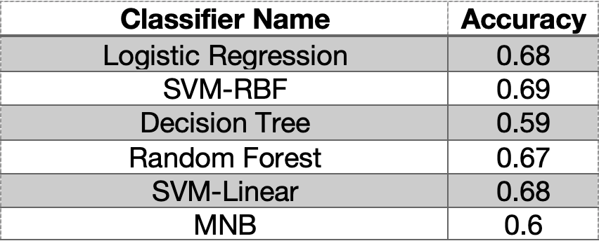
Table1: Classifier accuracy for sentiment analysis of tweets data (USA)
Approach 2: Topic Modeling (Unsatisfactory)
Topic modeling is an NLP technique that provides a way to compare the strength of different topics and tells us which topic is much more informative as compared to others. Topic models are unsupervised models with no need for data labeling. Because tweets are short it was really hard to differentiate between different topics and also correspond them to a specific topic using models such as LDA. Topic models tend to produce the best results when applied to texts that are not too short and those that have a consistent structure.
1. Using a semi-supervised approach
We chose a semi-supervised topic modeling approach (CorEX) [2]. Since the data was very high dimensional, we applied dimensionality reduction in order to remove noise and interpret the data. Permutation Test is used to determine the optimum number of principal components required for PCA [3,4]. From the explained variance ratio plot, it appeared that the cumulative explained variance line is not perfectly linear, but it is very close to a straight line.
Through permutation tests, I noticed that the mean of the explained variance ratio of permuted matrices did not really differ from the explained variance ratio of the non-permuted matrix which suggested that applying PCA on correlated topic model’s results were not helpful at all.
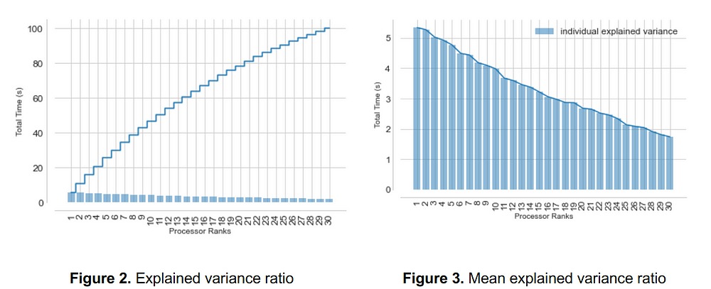
This means each of the principal components contributes to the variance explanation almost equally, and there’s not much point in reducing the dimensions based on PCA.
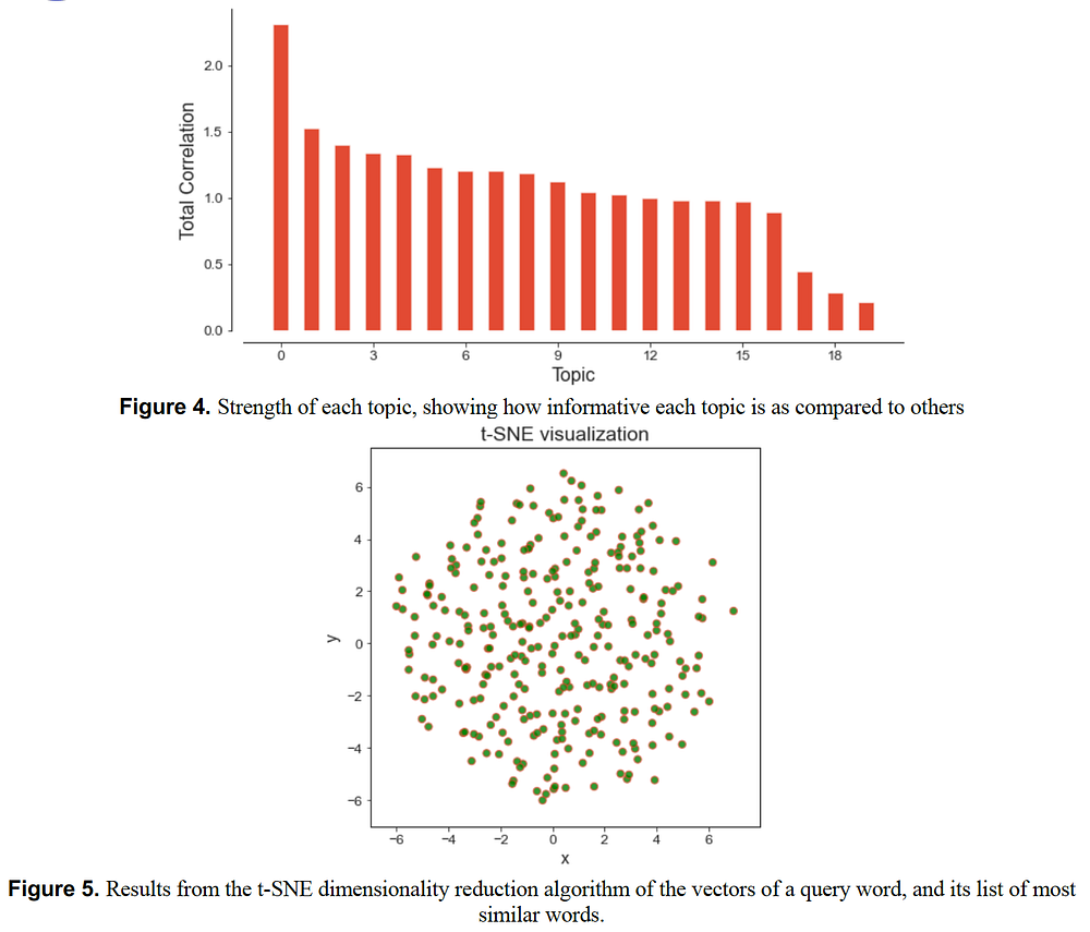
2. Identifying 20 important topics
The CorEx results showed that there are about 20 important topics and it was also showing the important words per topic. But how to interpret the results?
Data was very high dimensional and dimensionality reduction was not helpful at all. For example, if price, electricity, ticket, fuel, gas, and skepticism are the most important words for one topic how to understand the concerns of the people of that country? Is it fuel price that is of concern to them? Or electricity prices, or ticket prices? There could be a combination of many different possibly related words in each topic and by just looking at the important words in each topic, it would not be possible to find out what is the story behind data to harness clean energy for a better future.
Besides, bigrams or trigrams with topic models did not help much either because not the main keywords conveying the main focus of the tweet might always appear together.
Approach 3: Clustering (Kmeans & Hierarchical)
Both Kmeans and Hierarchical clustering models lead to comparable results illustrating separate clear clusters. Because both models have comparable performance, we derived all results using Hierarchical clustering which better shows the hierarchy of the clusters. Tweet data were collected for four different countries as discussed before and the model was applied to the data of each country separately to analyze the results. To summarize we only show the clustering results for India. But all the insights across countries are shown at the end of the article.
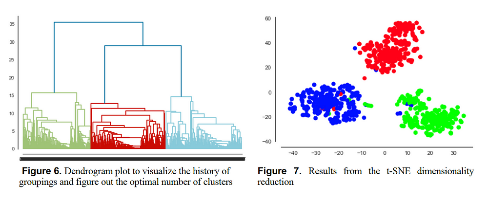
Hierarchical Clustering Results
After finding clear clusters from the data, the next step was interpreting the data by creating meaningful visualizations and insights. A combination of Scattertext, co-occurrence graph, dispersion plot, colocated word clouds, and top trigrams resulted in very useful insights from data to harness clean energy for a better future.
An important lesson to point out here is to always rely on a combination of various plots for your interpretations instead of only one. Each type of plot helps us visualize one aspect of data and combining various plots together helps to create a comprehensive clear picture from data.
1. Using Scattertext
Scattertext is an excellent exploratory text analysis tool that allows cool visualizations differentiating between the terms used by different documents using an interactive scatter plot.
Two types of plots were created which was very helpful in interpreting the results.
1) Visualizing word embedding projections. This has been explored using word association with a specific keyword. The keywords include the following: [Access, Availability, Affordability, Bills, Prices]. If the reader is interested, they can try more keywords using the provided code in this study.
2) In another plot, the uni-grams from the clustered tweets are selected and plotted using their dense-ranked category-specific frequencies. We used this difference in dense ranks as the scoring function.
All the interactive plots are stored in an HTML file and are available in the GitHub repository. If you click on the interactive version, the list of tweets with each specific term can be explored. Please note that first hierarchical clustering is applied to the data and then the clustered tweets are given to Scattertext as input. You can gain further information by diving deep into these plots. The data used for creating these results can be found here and the notebook to apply to cluster and create these scatter plots can be found here.
The following shows the interactive versions of all plots for various countries:
- India: Cluster 1 vs 2, Cluster 1 vs 3, Word Embedding: Prices, Word Embedding: Bills
- Nigeria: Cluster 1 vs 2, Cluster 1 vs 3, Word Embedding: Prices, Word Embedding: Access, Word Embedding: Affordability, Word Embedding: Availability
- UK: Cluster 1 vs 2, Cluster 1 vs 3, Word Embedding: Prices, Word Embedding: Bills, Word Embedding: Availability
- USA: Cluster 1 vs 2, Cluster 1 vs 3, Word Embedding: Prices, Word Embedding: Bills, Word Embedding: Availability
1.1. Rank and frequencies across different categories (India)
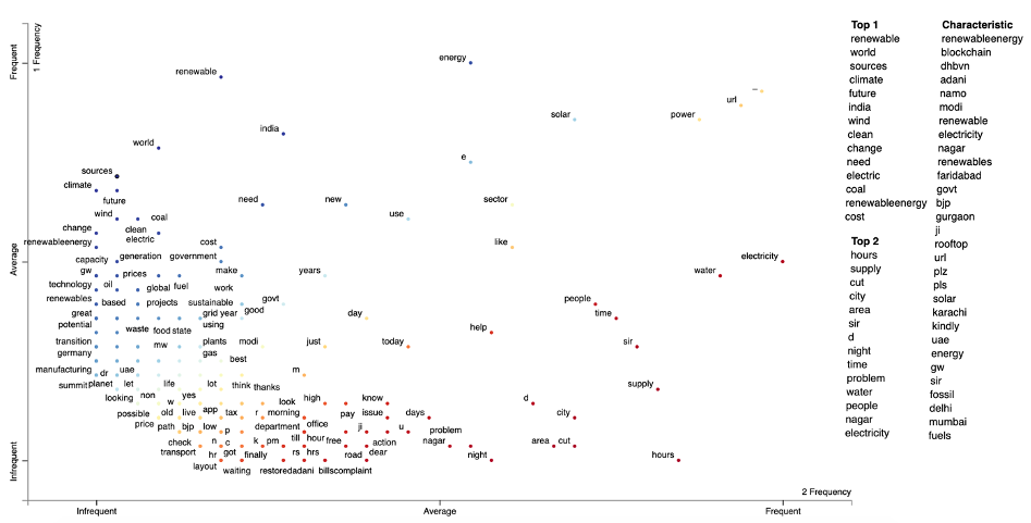
Figure 8. An example Scattertext plot showing positions of terms based on the dense ranks of their frequencies, for cluster 1 & 2. The scores are the difference between the terms’ dense ranks. The bluer terms are, the higher their association scores are for cluster 1. The redder the terms, the higher their association score is for cluster 2. See Cluster 1 vs 2 for an interactive version of this plot.
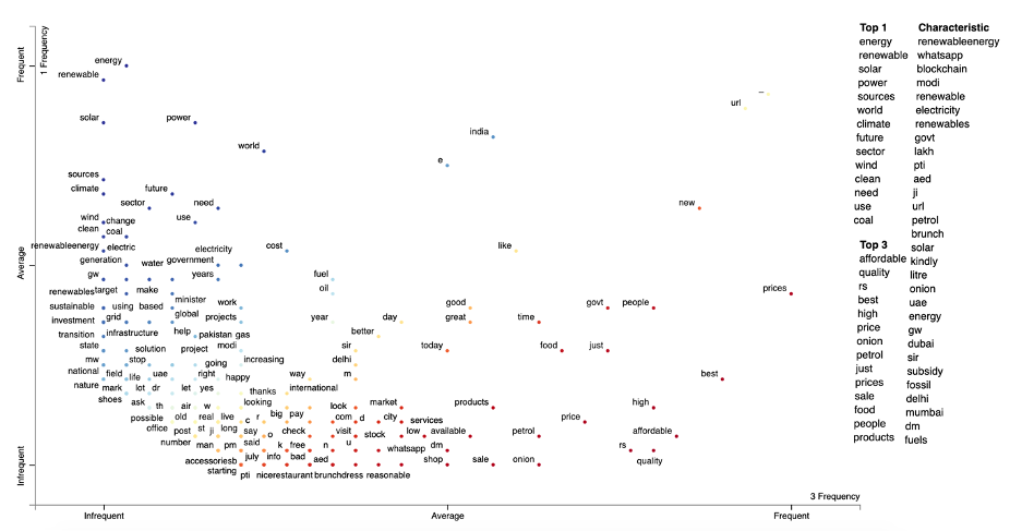
Figure 9. An example Scattertext plot showing positions of terms based on the dense ranks of their frequencies, for cluster 1 & 3. The scores are the difference between the terms’ dense ranks. The bluer terms are, the higher their association scores are for cluster 1. The redder the terms, the higher their association score is for cluster 3. See Cluster 1 vs 3 for an interactive version of this plot.
1.2. Word embedding projection plots using Scattertext (India)
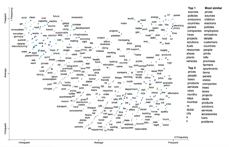
Figure 10. An example Scattertext plot showing word associations to term prices using Spacy’s pre-trained embedding vectors. This is used to see the terms most associated with the term prices. At the top right corner, we see the most commonly associated words with the term prices such as electricity. If you click on the interactive version, the list of tweets with the terms can be explored. See Word Embedding: Bills for an interactive version of this plot.
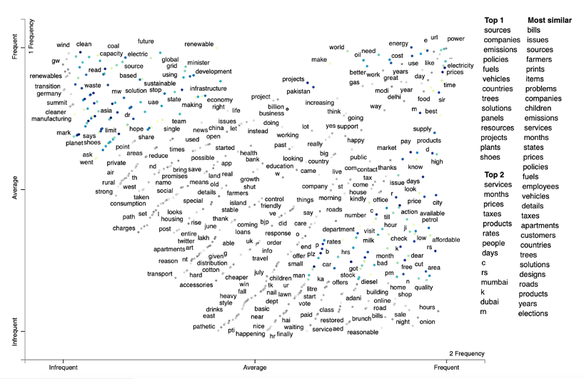
Figure 11. An example Scattertext plot showing word associations to term bills using Spacy’s pretrained embedding vectors. This is used to see the terms most associated with the term bills. At the top right corner, we see the most commonly associated words with the term bills such as electricity, prices, energy, power. If you click on the interactive version, the list of tweets with the terms can be explored. See Word Embedding: Prices for an interactive version of this plot.
2. Twitter Insights (Price & Energy Transition Concerns)
2.1. India
- Solar and wind don’t necessarily mean cheaper prices as it did not cause so in Germany. When Germany went all on renewables, energy prices and carbon emissions went up.
- The electrical prices can drop for people who are sourcing power from the government-owned renewable sources because the prices are not going to vary with oil and natural gas.
- Renewable energy policy can lead to much lower electricity prices, a stronger globally competitive economy, less import of fossil fuels, and as a result less pollution.
- Putting a tax on coal and making open access a reality are two potential action areas to make renewable energy affordable.
- Let oil prices increase and subsidies stop.
- Many requests to replace fossil fuels with cleaner fossil fuels such as stubbles from farmers.
- Cut oil imports and encourage renewable energies.
- A lot of complaints regarding electricity shortage, lack of electricity for hours or days, electricity cut, electricity, and water supply.
- Fossil fuels are dirty, and Nuclear power is dangerous. Therefore, we need to make renewable energy work or harness clean energy for a better future.
2.2. Nigeria
- People complaining about no constant electricity, and zero business-friendly policy.
- Enhancing the delivery of electricity in the country.
- Whenever it rained electricity supply was cut off for days, lack of electricity every weekend daily and overnight, and unstable electricity.
- No water and no electricity.
- The electricity sector is the third main consuming sector of oil.
- Lots of worries and trouble regarding paying electricity bills.
- Access to electricity is not for everyone.
- Access to affordable sustainable renewable energy.
- Renewable energy water and waste management are some of Nigeria’s major partnership areas with Ghana.
- Harnessing tidal or offshore wind energy which is a clean and renewable source.
- Lots of positive experiences and low prices with the usage of Solar power systems.
2.3. UK
- Bringing down the prices of electricity and gas.
- Having stable prices for electricity.
- People prefer higher prices for gas than electricity.
- Need to think beyond electricity to affect the energy transition.
- Renewables disrupt the electricity market and politicians raising electricity prices to tackle climate emergency problems is an awful policy.
- A lot of requests on investment in Renewable Energies.
- The transition to renewable is being too slow.
- Lots of discussions on whether it is good to replace the nuclear stations with renewables.
- Whether the zero-carbon economy has any economic benefit for the UK.
2.4. USA
- Slowing down climate change.
- Market-based solutions for climate change.
- Renewable energy infrastructure is lame and unreliable.
- Renewables increase electricity prices and distort energy markets with favorable purchase agreements.
- Many complaints regarding gas prices.
- National security’s priority should be on renewable energy Investing in its infrastructure and jobs progs.
- Figure out how to store renewable energy and get rid of excess CO in the atmosphere.
- Renewable energy represents a significant economic opportunity.
3. Weighing a word´s importance via Dispersion Plot
A word’s importance can be weighed by its dispersion in a corpus. Lexical dispersion is a measure of a word’s homogeneity across the parts of a corpus. The following plot notes how many times a word occurs throughout the entire corpus for different countries including India, Nigeria, UK, and the USA.
According to the following dispersion plot, access to electricity is an important concern for Nigeria while this is not the case for the other three countries. How do we know that this access is related to electricity? Well, the answer is Scattertext plots shown in the previous section. Analyzing those plots together with the dispersion plot shows that the concern is electricity access.
Access to affordable renewable energy is a big concern in Nigeria and then India, while the affordability of renewable energy is not a problem for people in the UK and the USA. Affordability is a big concern for the people in Nigeria and people have difficulty paying their electricity bills.
Energy, electricity, power, and renewables are also the topic of most of the discussions in all of these countries. But what aspects of each topic are of concern to each country? The answer is given in the previous section where we interpret the results of Scattertext plots.
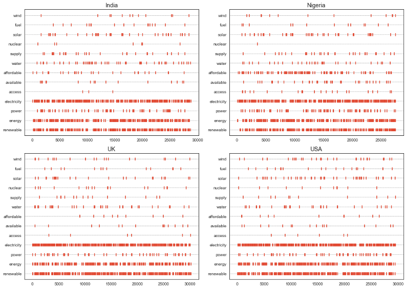
Figure 12. Lexical dispersion for various keywords across different countries
4. Top Trigrams for Different Countries
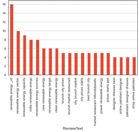
Figure 13. Top twenty trigrams for India
As can be seen from the top 20 trigrams for India the top concerns are Renewable energy, Renewable energy sector, Renewable energy capacity, Renewable energy sources, New renewable energy, and clean renewable energy. These top concerns specifically match the insights drawn from clustering in the previous section.
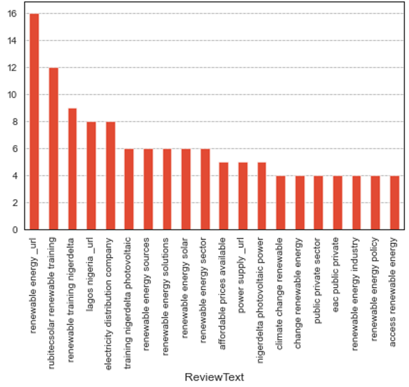
Figure 14. Top twenty trigrams for Nigeria
As can be seen from the top 20 trigrams for Nigeria the top concerns are Renewable energy, Renewable energy training, Electricity distribution companies, Renewable energy sources, Renewable energy solutions, Solar renewable energy, Renewable energy sector, Affordable prices, Power Supply, Climate change renewables, Public-private sectors, Renewable energy industry, Renewable energy policies, and Access to renewable energy. These top concerns specifically match the insights drawn from clustering in the previous section.
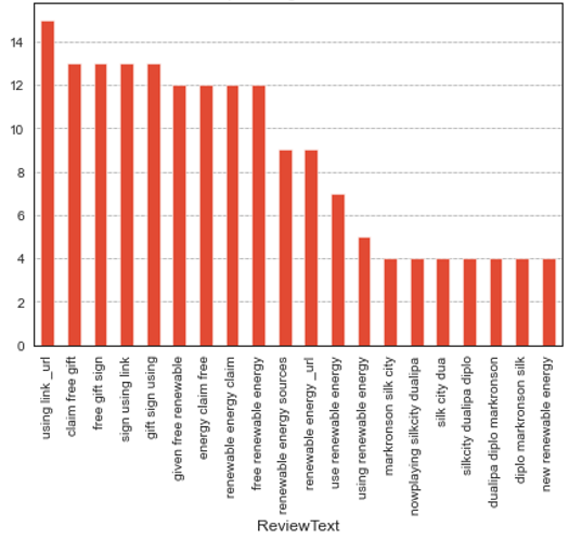
Figure 15. Top twenty trigrams for UK
As can be seen from the top 20 trigrams for the United-Kingdom the top concerns are Free renewable energy, Renewable energy sources, Using renewable energy, New renewable energy. These top concerns specifically match the insights drawn from clustering in the previous section.
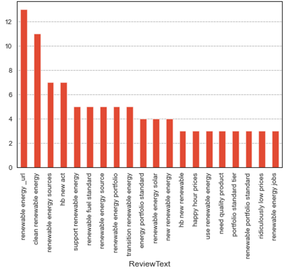
Figure 16. Top twenty trigrams for USA
As can be seen from the top 20 trigrams for the USA the top concerns are Clean renewable energy, Renewable energy sources, Supporting renewable energy, Renewable fuel standard, Transition into renewable energy, Solar renewable energy, New renewable energy, Using renewable energy, Need for quality products, and renewable energy jobs. These top concerns specifically match the insights drawn from clustering in the previous section.
5. Collocated word clouds & Co-occurrence Network
The following plots display the networks of co-occurring words in tweets in different countries. Here, we visualize the network of top 25 occurring bigrams. The connection between the words confirms the insight derived in the previous section for all cases.
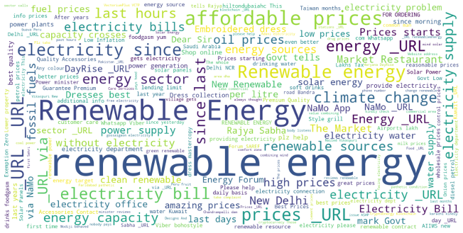
Figure 17. Collocate Clouds-India
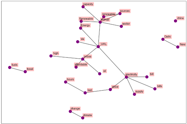
Figure 18. Co-occurrence Network-India (First 25 Bigrams)
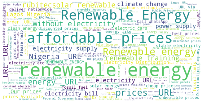
Figure 19. Collocate Clouds-Nigeria
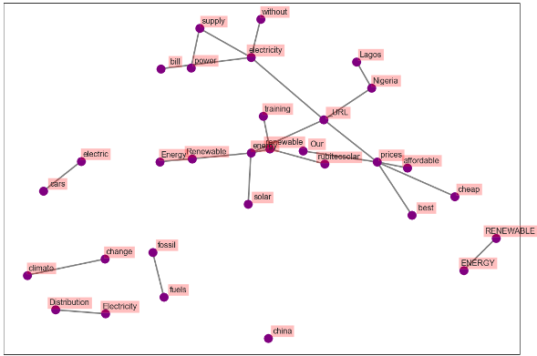
Figure 20. Co-occurrence Network-Nigeria (First 25 Bigrams)
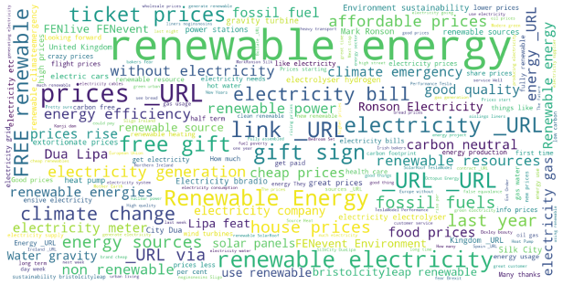
Figure 21. Collocate Clouds-UK
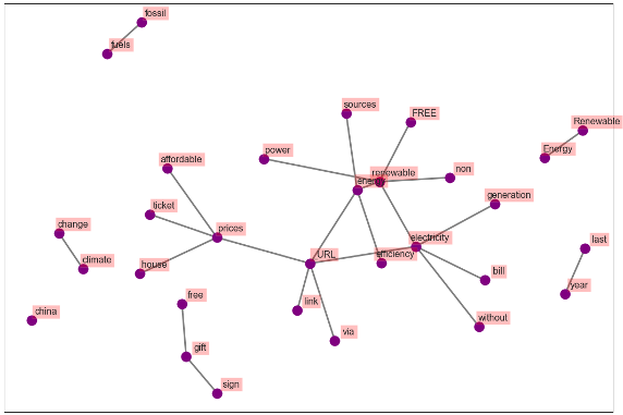
Figure 22. Co-occurrence Network-UK (First 25 Bigrams)
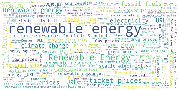
Figure 23. Collocate Clouds-USA
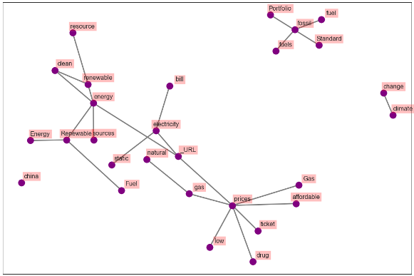
Figure 24. Co-occurrence Network-USA (First 25 Bigrams)
You might also like


