Solar GIS Mapping with Satellite Imagery to Locate Ideal Installation Sites in Africa
Satellite imagery and GIS layers reveal poorly lit, populated regions in Nigeria, helping target off-grid solar projects where access is lowest.

The Nigerian NGO Renewable Africa (#RA365) has set out to install off‑grid solar containers to mitigate Nigeria’s chronic lack of electricity access, where only half of the country’s 198 million residents enjoy a reliable power supply. To tackle this enormous challenge, the team adopted a solar data science approach, using demographic surveys and satellite imagery to identify communities with unmet electricity demand.
Central to this effort is the Demographic and Health Surveys (DHS) program, which provides extensive data on African and other developing countries. Researchers have frequently leveraged this dataset to gauge the state of energy access, and similar plots appear widely across academic literature. However, the Nigerian DHS dataset is based on a 2015 survey of roughly 1 000 households per state and does not specify the precise geographic location of each household. Even so, it paints a stark picture: in Sokoto state, for example, only 239 of the 1 194 sampled households (about 20 %) had access to electricity in 2015. Those statistics underscore the urgency of deploying renewable energy solutions where they are most needed.
Exploring Electricity Demand Through DHS Data
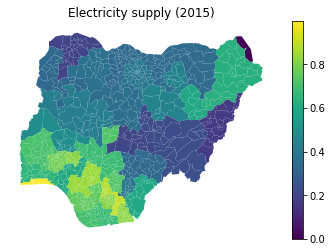
Exploring DHS data on Nigerian Electricity Demand in 2015: Github
The DHS data laid the foundation for understanding regional disparities in electricity access. Yet the absence of precise household coordinates meant that a more refined spatial analysis was required. To locate high‑demand areas for solar containers, the team turned to geospatial techniques and nighttime satellite imagery.
Nighttime Satellite Imagery and Population Datasets
Nighttime satellite imagery offers a striking visual proxy for electricity consumption. By comparing these images against population distribution, one can estimate where people live without adequate lighting. This strategy leverages a core principle of solar land GIS mapping the integration of spatial data to identify optimal locations for solar infrastructure.
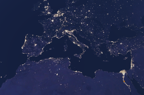
Night sky image in Google Earth Engine
Nighttime lights indicate electrification, but we first needed to locate where people live. We initially considered a UNet-based model to detect rooftops from satellite images, but instead turned to the WorldPop dataset in Google Earth Engine (GEE), which maps population using surveys and machine-learning interpolation. We also used the higher-resolution GRID3 dataset, validated through vaccination campaigns, to improve accuracy.
With both datasets in hand, the fundamental equation for estimating unmet demand became straightforward:
demand = population × (no lights)
In practice, we loaded the GRID3 population estimates into GEE, combined them with monthly median nighttime lights from the NOAA VIIRS dataset, and filtered each according to threshold values for population density and light intensity. The following code snippet illustrates how the demand layer is constructed in GEE:
// GRID3 population data
var img_pop3 = ee.ImageCollection(‘users/henrique/GRID3_NGA_PopEst_v1_1_mean_float’);
// Nigerian nightlights (1‑year median)
var nighttime = ee.ImageCollection(‘NOAA/VIIRS/DNB/MONTHLY_V1/VCMSLCFG’)
.filter(ee.Filter.date(‘2018–09–01’, ‘2019–09–30’))
.median()
.select(‘avg_rad’)
.clipToCollection(nigeria);
// Demand layer: threshold population multiplied by absence of light
var demand = img_pop3.gte(pop_threshold)
.multiply(nighttime.lte(light_threshold));
Readers interested in exploring the full script can follow this link.
Calibrating Thresholds and Overcoming Data Noise
Two primary challenges emerged during analysis. First, both the population and light‑intensity datasets contain inherent noise that could obscure genuine signals. Second, with so many potential demand points across Nigeria, it was essential to identify truly optimal places for installing solar containers. To calibrate our thresholds for minimal population density and minimal light levels, we leveraged several sample villages where electricity supply conditions were already known. This calibration ensured that the algorithm distinguished between genuinely dark, populated areas and spurious data artifacts.
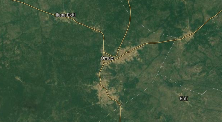
The region around Omuo, Ekiti
This view of Omuo in Ekiti state serves as a calibration site. By examining villages with known electricity supply, we fine‑tuned the thresholds for population density and light intensity in our algorithm. Such ground‑truth locations help ensure that the model correctly distinguishes between well‑electrified communities and those still in darkness.
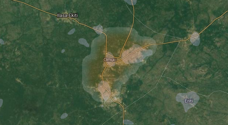
Overlay with both NOAA datasets VIIRS (blue) and DMSP‑OLS (orange) nighttime lights, smoothed by a Gaussian convolutional filter
The dual‑dataset overlay above compares NOAA’s VIIRS data (in blue) with DMSP‑OLS imagery (in orange). Applying a Gaussian filter reduces noise and highlights persistent lighting patterns. Areas where both datasets register low radiance are strong candidates for off‑grid solar installations because they likely represent populated yet poorly lit regions.
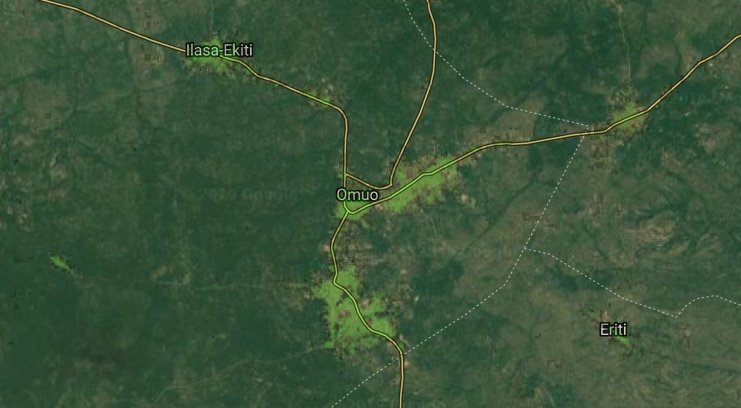
Overlay with GRID3 population data (green)
The final overlay adds the GRID3 population layer in green. When visualised together, the night‑light and population layers reveal where dense settlements coincide with limited illumination. These are precisely the zones that solar land GIS mapping seeks to identify, guiding investment toward communities with the greatest unmet energy demand.
The overlays above illustrate how combining VIIRS and DMSP‑OLS datasets, smoothed by a Gaussian convolutional filter, reveals subtle differences in night‑light intensity. The green layer represents population density from GRID3. Together, these layers allow analysts to visualise where large numbers of people live in darkness at night.
Building the Location Heatmap
A significant portion of a solar container’s installation cost arises from wiring and electricity distribution. The relationship between distance and cost is nonlinear—supplying power to a house 200 m away costs more than twice as much as supplying one at 100 m. We assumed that the optimal distance between a solar panel and a household follows a Gaussian distribution because wiring costs increase with distance. As a result, both the noisy nightlight data and the underlying demand benefit from smoothing via Gaussian convolutional filters. This approach highlights clusters of high demand while reducing random fluctuations.
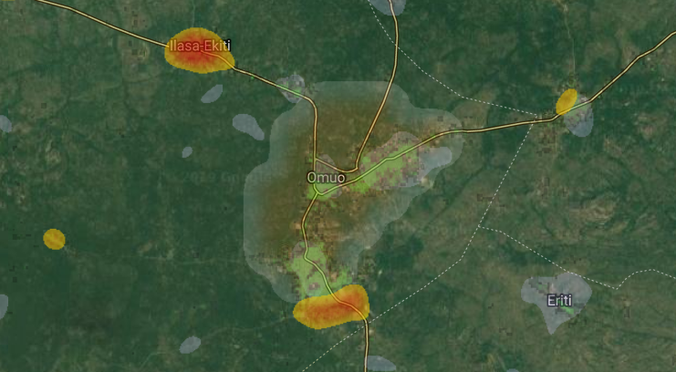
Demand heatmap
This demand heatmap synthesises the calibrated population and night‑light datasets. Hotter colours indicate clusters of people living in darkness; cooler colours mark regions with better electrification. Such maps translate raw data into actionable insight, showing planners where solar containers can deliver the most benefit. The same satellite-based reasoning framework has been applied in other renewable projects — explore how AI can accelerate rural solar electrification in our case on AI for Solar Energy.
Segmenting Demand Clusters
To identify specific high‑demand clusters, we experimented with multiple image‑segmentation techniques in GEE. Surprisingly, the simplest method connected components outperformed more complex algorithms. The following code demonstrates how we applied GMeans, SNIC, and connected components to the smoothed demand layer:
// GMeans Segmentation
var seg = ee.Algorithms.Image.Segmentation.GMeans(
smooth.gt(demand_threshold), 3, 50, 10);
Map.addLayer(seg.randomVisualizer(), {opacity: 0.5}, ‘GMeans Segmentation’);
// SNIC Segmentation
var snic = ee.Algorithms.Image.Segmentation.SNIC(
smooth.gt(demand_threshold), 30, 0, 8, 300);
Map.addLayer(snic.randomVisualizer(), {opacity: 0.5}, ‘SNIC Segmentation’);
// Connected components: uniquely label the patches and visualise
var patchid = smooth.gt(demand_threshold)
.connectedComponents(ee.Kernel.plus(1), 256);
Map.addLayer(patchid.randomVisualizer(), {opacity: 0.5}, ‘Connected Patches’);
The complete implementation of these segmentation algorithms can be found at this link.
Estimating Population Within Each Cluster
Beyond identifying where electricity demand clusters, we needed to quantify how many people live within each patch. GEE’s reduceConnectedComponents() function makes it easy to sum population density across each labelled area. The code below shows how we calculated total population per cluster and reprojected the result to the original scale:
// Add a label band to the population image
img_pop3 = img_pop3.addBands(patchid.select(‘labels’));
// Calculate total population in each demand area
var patchPop = img_pop3.reduceConnectedComponents({
reducer: ee.Reducer.sum(),
labelBand: ‘labels’,
}).rename([‘pop_total’]).reproject(img_pop3.projection());
The full script for this population‑reprojection step is available at this link. Once the clusters and population estimates were computed, GEE allowed us to export the raster data as a GeoTIFF file. From there, we used GeoPandas to derive contours, centroids, and other geometries, linking them back to Google Maps for further exploration.
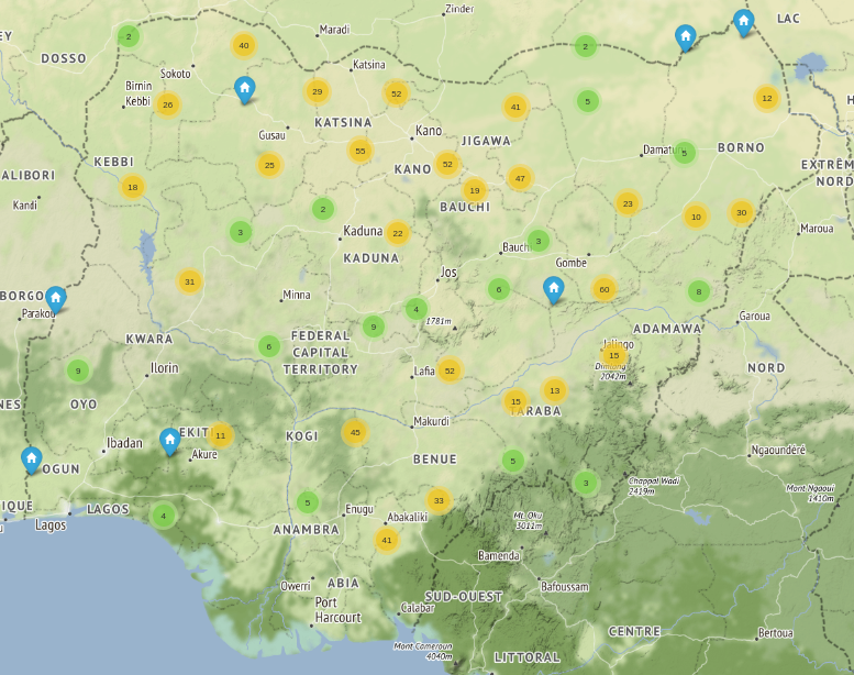
Interactive map using Folium and leaflet.js on Jupyter (all potential locations with a population above 4 000)
Conclusion
Our GIS-based workflow effectively combines population datasets and nighttime satellite imagery to highlight areas of Nigeria that remain underserved by electricity. By identifying clusters where large communities live in darkness, the approach offers Renewable Africa a data-backed method to prioritize locations for off-grid solar installations and reduce uncertainty in the planning stage.
Because the datasets and scripts are open and approachable, this methodology can be easily adapted for other regions facing similar energy challenges. With continued refinement, it can support governments, NGOs, and energy planners in accelerating rural electrification and improving quality of life for thousands of people.
Transform uncertainty into actionable guidance by partnering with Omdena to analyze unmet demand, prioritize ideal sites, and scale renewable energy where it matters most.


