
Satellite Imagery Analysis and Heatmaps to Identify the Best Areas for Solar Energy in Africa
May 11, 2020

The demand for solar energy
The Nigerian NGO Renewable Africa #RA365 has the mission to install off-grid solar containers to mitigate the lack of electricity access in the country, where only half of the population of 198 million has stable access to the power supply. We came up with the solution by using the Solar Data Science concept.
The Demographic and Health Surveys (DHS) provide a large amount of data on African and other developing countries.

Exploring DHS data on Nigerian Electricity Demand in 2015: Github
This dataset has been used by several researchers and plots similar to the above can be found throughout the internet and literature. However, the dataset in Nigeria is based on a 2015 survey of about only 1000 households per state, without specifying their precise geographic location within each state. Nevertheless, it shows the critical state of energy access in Nigeria. For example, from the 1194 sampled households in Sokoto state, only 20% (239) had access to electricity in 2015.
Our approach — Nighttime images
We quickly came up with the idea of comparing nighttime satellite imagery against the geographic location of the population.
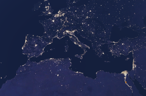
Night sky image in Google Earth Engine
Although the nightlights seem quite straightforward to use, we still needed to find where all the Nigerian houses are located, and then check if they are lit up at night or not (demand).
We initially thought of using a UNet-like model to detect or segment the house roofs from the sky. This has been done already in several machine learning competitions, however, we came across the population dataset from WorldPop, which is also available in Google Earth Engine and uses ground surveys and machine learning to fill the gaps.
GRID3 is another dataset from the same group, which has been validated during vaccination campaigns and provides much higher resolution and precision.
With both datasets in hand, the math seems easy: demand = population and no lights.
// GRID3 population data
var img_pop3 = ee.ImageCollection('users/henrique/GRID3_NGA_PopEst_v1_1_mean_float')
// Nigerian nightlights (1Y median)
var nighttime = ee.ImageCollection('NOAA/VIIRS/DNB/MONTHLY_V1/VCMSLCFG')
                  .filter(ee.Filter.date('2018–09–01', '2019–09–30'))
                  .median()
                  .select('avg_rad')
                  .clipToCollection(nigeria);
// Demand layer
var demand = img_pop3.gte(pop_threshold) // threshold population
                     .multiply(nighttime.lte(light_threshold)) // population without lights
Here is the code snippet link.
Challenges to overcome
However, we first have to take into consideration the noise present in each one of the datasets. And secondly, find the optimal places for Installation of the Solar containers by using Geographical Data Science, within the immense sea of electricity demand in Nigeria, Africa.
We also used a few sample villages (where the electricity supply was known) to calibrate the thresholds of minimal population density and minimal light levels to consider into the algorithm.
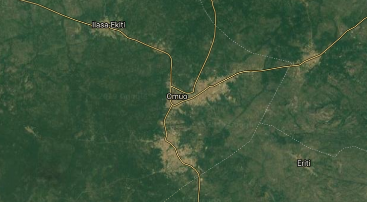
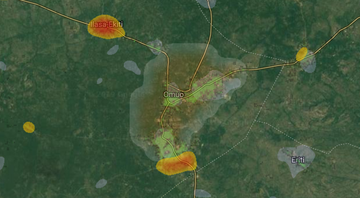
The region around Omuo, Ekiti
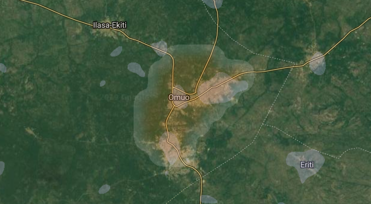
Overlay with both NOAA datasets VIIRS (blue) and DMSP-OLS (orange) nighttime lights, smoothed by a Gaussian convolutional filter
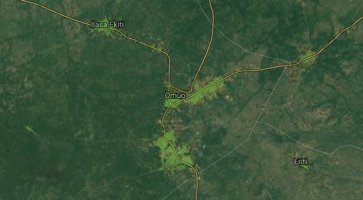
Overlay with GRID3 population data (green)
Building the location heatmap
A large part of the container installation cost is due to the wiring and distribution of the electricity. This cost has a nonlinear relationship to the distance between the panel and the house to be supplied with energy, in the way that it is much cheaper to supply to nearby houses.
For example, a house 200m away from the energy source should cost more than 2x the cost of one at 100m.
We assume the optimal solar panel location in relation to a household will approximately follow a Gaussian distribution due to the wiring cost. Therefore both noisy nightlights and the electricity demand itself can be smoothed out by applying Gaussian convolutional filters in order to find the best spots for the solar panel installation.
Demand heatmap
Finally, we tried several image segmentation techniques to capture the clusters of demand, however, the best technique in GEE turned out to be the very simple “connected Components algorithm”.
// GMeans Segmentation
var seg = ee.Algorithms.Image.Segmentation.GMeans(smooth.gt(demand_threshold), 3, 50, 10);
Map.addLayer(seg.randomVisualizer(), {opacity:0.5}, 'GMeans Segmentation');
// SNIC Segmentation
var snic = ee.Algorithms.Image.Segmentation.SNIC(smooth.gt(demand_threshold), 30, 0, 8, 300);
Map.addLayer(snic.randomVisualizer(), {opacity:0.5}, 'SNIC Segmentation');

// Uniquely label the patches and visualize.
var patchid = smooth.gt(demand_threshold)
                    .connectedComponents(ee.Kernel.plus(1), 256);
Map.addLayer(patchid.randomVisualizer(), {opacity:0.5}, 'Connected Patches');
Here is the code snippet link for GEE Algorithms for Image Segmentation
Additionally, we can sum the population density of each area to estimate the total population of each cluster.
// Make a suitable image for `reduceConnectedComponents()`
// by adding a label band to the `img_pop3` image.
img_pop3 = img_pop3.addBands(patchid.select('labels'));

// Calculate the total population in demand area
// defined by the previously added "labels" band
// and reproject to original scale
var patchPop = img_pop3.reduceConnectedComponents({
  reducer: ee.Reducer.sum(),
  labelBand: 'labels',
}).rename(['pop_total']).reproject(img_pop3.projection())
Here is the code snippet link.
GEE allows you to export the raster as a TIF, which can then be worked on GeoPandas to find their contour and centroids and link it back to google maps for further exploration.
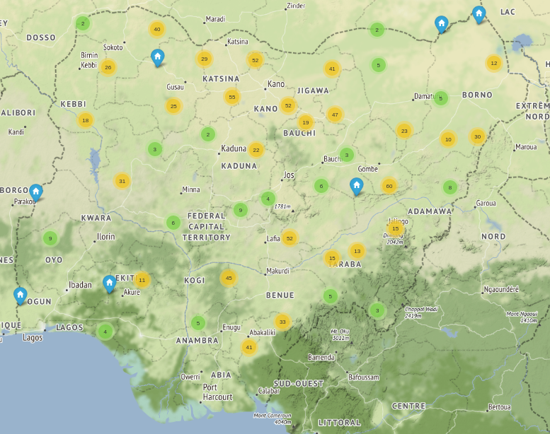
Interactive map using Folium and leaflet.js on Jupyter (all potential locations with a population above 4000)
Conclusion
We showed how to combine satellite imagery and population data to create an interactive map and a list of the top Nigerian regions with high demand for electricity by the usage of Solar containers Installation, via Geographical Data Science.
The NGO Renewable Africa will use those tools to survey and validate the locations before installing the solar panels. This should have a real impact on the lives of thousands of people in need. Additionally, this report can also be used to show where the demand lies and help to pressure the local government into action.
We also hope that the initiative is followed by the neighboring and other developing countries, as all the methodology and code used here can be easily transferred to other locations.
The Code
Source code for both GEE and the Colab notebook is available here.
—
This article is written by Henrique Mendonça.
Want to work with us?
If you want to discuss a project or workshop, schedule a demo call with us by visiting: https://form.jotform.com/230053261341340
Related Articles


